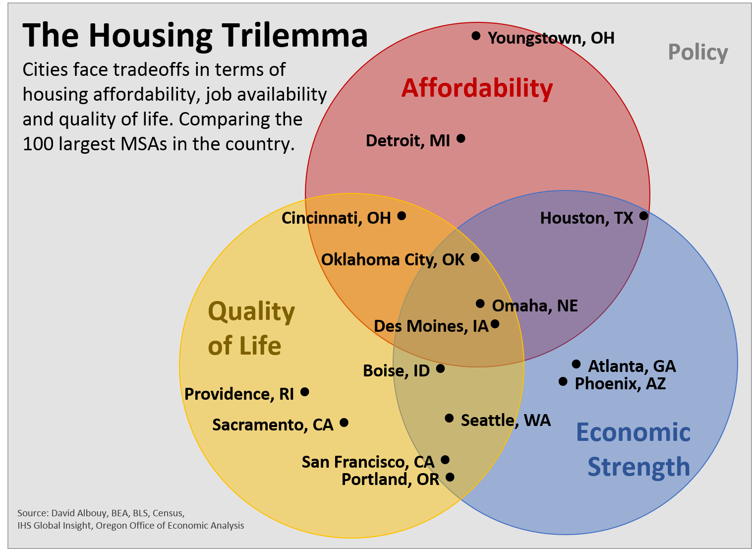
Every city wants to have a strong local economy, high quality of life and housing affordability for its residents. Unfortunately these three dimensions represent the Housing Trilemma. A city can achieve success on two but not all three at the same time. Underlying all of these tradeoffs are local policies as well.
Inspired by Kim-Mai Cutler and Cardiff Garcia, I set out to try and quantify the Housing Trilemma across the nation’s 100 largest metropolitan areas. It turns out to be very real. Just eight rank among the top half for all three dimensions of the Housing Trilemma. None rank among the Top 20 in all three. Unless you prefer living on the Great Plains, that list of eight metros lacks sizzle*.
Update: All 100 MSAs fall within the Venn diagram below. The metros listed are to show some individual metros that are representative of each part of the diagram. For example, New York City slots in right between San Francisco and Portland. Kansas City is just to the right of Oklahoma City. And so forth. Email me if you would like a version with your metro on it.
The reason these tradeoffs exist is mostly, but not entirely, due to market forces. People want to live in cities with a strong economy and high quality of life. Increased demand for housing leads to higher prices and lower affordability. Nice places to live get their housing costs bid up due to strong demand. The opposite is true as well. Regions with underperforming economies and a lower quality of life do have better affordability.
Below are the Housing Trilemma graphs for Portland, Houston and Youngstown to give a few examples of how each city compares to the nation’s 100 largest metros. Note that the bars represent percentiles, or rankings. This is to make the graph easy to read and visually intuitive. The longer the bar, the better a particular metro ranks on that measure. Click here for an interactive version** where you can pick and choose any metro to examine and/or download the data. Go to the “graph” tab and choose a metro from the dropdown menu. Take it for a test drive. The specifics of each metric are shown at the end of the post.
UPDATE: Some are noting issues with the interactive version. Download in Excel here: HousingTrilemma


Google Docs Version or Excel Download: HousingTrilemma
Clearly a few patterns emerge. In particular the popular metropolitan areas stand out, not least because their eroding housing affordability is constantly discussed. What you could call the cool city profile is seen in the Denvers, Portlands and San Franciscos of the world. In a way, they are victims of their own success. Their strong regional economy and high quality of life do come as the cost of lower housing affordability.
Yet even among this group, affordability does vary. Portland is an extreme case with significantly more households cost-burdened and a lower vacancy rate than nearly all other metros in the nation. This impacts renters the most, including younger households and those on fixed incomes.
For these popular metros, more construction is required, but that alone is not enough. Just look at Austin, TX. The region has a very strong economy and high quality of life. Despite leading the nation’s largest metros in new construction, Austin is only able to reach middling affordability. Austin’s home prices, while lower than Portland’s or Seattle’s, are still relatively high and half of all renters are cost-burdened. Increasing construction is able to help with broad, regional affordability, but cannot fully offset the premium required to live in a popular place. In addition to building more homes, targeted programs are also needed to help less fortunate neighbors bear these costs.
The housing trilemma is real. Tradeoffs are inevitable. Here in Portland and the Northwest more broadly, we are fortunate enough to have a good economy and desirable quality of life. We should work to maintain these successes. However, eroding affordability in Portland does not have to be a permanent trend. Increasing construction to match a growing population and strong assistance programs are needed.
Here are the exact measures used.

* Full disclosure: I am from the Great Plains and many of my relatives still live there. However, my wife likes to joke that it’s a great place to be from. These metros usually don’t knock it out of the park on any particular measure, however they are successful and do rank relatively well when compared to the rest of the nation’s largest metros.
** Apologies for the external dataviz link. Having difficulty embedding the work on our site. Let me know if you have any questions.

Unfortunately the “Graph” tab doesn’t seem to let me choose anything from a drop down menu. I downloaded the excel document manually and was able to access the drop down, however the formatting is all off so the output is meaningless.
By: Nate on June 8, 2016
at 12:54 PM
Thanks Nate for the heads up. Updated the post with an Excel download. Let me know if that doesn’t work.
By: Josh Lehner on June 8, 2016
at 1:09 PM
Why is household income listed under quality of life and not under economic strength? An economically strong region is one with high wages and vice versa, and sometimes it’s even in opposition to quality of life issues. (If we think of quality of life as consumer amenities – clean air, good schools, pleasant weather, short commutes, etc. – then these tend to suppress real wages, because workers are willing to accept lower wages to get these benefits.) By this metric, Houston is still an economically strong city, but Atlanta, which has had negative per capita income growth since 2000, isn’t.
By: Alon Levy on June 8, 2016
at 3:13 PM
For these purposes, it is included under Quality of Life in the sense of how far one’s dollar goes in a particular city. So the combined QoL looks at the consumer amenities and how much the typical household can afford when it comes to purchasing things. It is adjusted for cost of living as well. But, to your broader point, yes income is also an economic measure too.
By: Josh Lehner on June 10, 2016
at 3:32 PM
[…] Josh Lehner, at the Oregon Office of Economic Analysis, has an interesting post today: The Housing Trilemma […]
By: Lehner: "The Housing Trilemma" – The Mortgage Truth on June 8, 2016
at 8:34 PM
[…] unseen cascading effects. Josh Lehner, an economist at the Oregon Office of Economic Analysis, was partly inspired by this tweet to introduce his own version of a housing […]
By: The housing trilemma | AnncPress on June 9, 2016
at 1:13 AM
[…] unseen cascading effects. Josh Lehner, an economist at the Oregon Office of Economic Analysis, was partly inspired by this tweet to introduce his own version of a housing […]
By: The housing trilemma on June 9, 2016
at 1:38 AM
[…] unseen cascading effects. Josh Lehner, an economist at the Oregon Office of Economic Analysis, was partly inspired by this tweet to introduce his own version of a housing […]
By: The housing trilemma | Culture Across on June 9, 2016
at 1:44 AM
[…] unseen cascading effects. Josh Lehner, an economist at the Oregon Office of Economic Analysis, was partly inspired by this tweet to introduce his own version of a housing […]
By: The housing trilemma | ABC Featured on June 9, 2016
at 8:07 PM
[…] Pick two of three: Affordable housing, quality of life, and economic strength. That’s the message of Josh Lehner at the Oregon Office of Economic Analysis, who uses a set […]
By: The Week Observed: June 10, 2016 | City Observatory on June 10, 2016
at 9:26 AM
[…] Source: The Housing Trilemma | Oregon Office of Economic Analysis […]
By: The Housing Trilemma | Oregon Office of Economic Analysis | Underwriting Solutions LLC on June 10, 2016
at 10:45 AM
Why does the chart have so few cities? Where is NYC, DC or LA?
By: David Nassau on June 10, 2016
at 2:04 PM
There are simply too many cities to list on one graph. A few representative cities are listed for each part of the chart to illustrate the types of places in each area.
By: Josh Lehner on June 10, 2016
at 3:08 PM
This is a great graph, I bet a talented graphic designer coukd embed several hundred towns in a few pixels that only become viewable when mouse rolls over it.
I would love to see this promoted much more.
Cities are where more and more of us will live, from Detroit to San Francisco, from Omaha to NYC, cities are usually the fortune tellers.
If we don’t get this affordability versus livability and economic success right, most regular will be like non-coders, non-real estate speculators in SF….screwed….a lucky few will be in Elysiums, the rest of regualr people wI’ll be spending more than half their earnings rent.
By: Karen on April 12, 2017
at 5:28 PM
The PNW is going to go through all sorts of growing pains and it’s deep in another housing bubble. I’ve noticed this for a while now, but Seattle is far more affordable than Portland. Housing costs are about the same (cheaper in some parts of Seattle for a good neighborhood and school district), but incomes are higher in Seattle, plus you don’t have the 10% Oregon State tax to deal with, which is like getting nearly a 10% raise in itself. If you aren’t already settled in Oregon, there just isn’t much to offer anymore, yet people continue to pile in with outside money and fan the flames. Until Portland starts building up apartment, condo, and mixed-use high rise buildings, the housing crisis will continue there. Seattle is a tad better but still doesn’t have enough high rise living either. It’s a city, time to start building up like one.
Phoenix is pretty affordable and has an excellent quality of life, I am a little surprised it is scored so low here. Maybe it’s the political climate, which is grouchy sometimes. There are good houses in great areas in Phoenix for $250,000 or so, and wages are about the same as Portland or Seattle. Sure you’ll use air conditioning for about four of five months of the year, but it’s sunny for 12 months too. Many houses have pools as well. A lot of people go vacation in Palm Springs, but Phoenix is living that fulltime.
Atlanta is also very affordable, another place I am puzzled why it’s rated so poorly here. It’s affordable, beautiful, polite people, good economy, just as green as the northwest, but far sunnier. Why the low rating? The humid summer months maybe? You can buy a nice house in Atlanta for $150,000, try that in the northwest!
But overall yes the midwest is really an impressive place for affordability, income, and quality of life. It’s almost like people have forgotten it exists, flyover country and all, but holy cow is it nice. I have a relative that was transferred to the midwest from Seattle, and they’re just shocked at how cheap everything is in comparison. $200,000 buys you a home that would cost a $1 million or more in Portland or Seattle. They make the same amount of money there too! Spend some time in Minnesota and it is pretty amazing, the winters are overblown and really not much different from a winter in Spokane, except they salt the roads out there so it’s much easier to drive around.
By: Douglas J. Turner on June 10, 2016
at 5:55 PM
Thanks for the comment and appreciate the insights and perspective here. When looking at all 3 affordability metrics, Seattle does rank 20 places higher than Portland due to a much smaller share of the rental population being rent burdened and a higher vacancy rate.
As for Phoenix and Atlanta, while both Sun Belt cities they are a little different in the data used here. Phoenix has a very good Quality of Life in the academic work but relatively low household purchasing power. Atlanta is the opposite. They both rank around 50th or so for the affordability, so certainly pretty good but not great across all 3 measures.
The Midwest doesn’t knock it out of the park on any one dimension but score well across all three, hence their placement in the chart. But from personal experience, I like it a lot. Then again, I did move away, so I don’t know quite what that shows…
By: Josh Lehner on June 12, 2016
at 2:36 PM
Why aren’t diversity, number of colleges/university, or educational attainment included in quality of life? Or perhaps even something like community social capital? http://www.ksg.harvard.edu/saguaro/communitysurvey/results5.html Why include slope?
By: Tarita on June 11, 2016
at 10:10 AM
Thanks for the comment. The Quality of Life data comes from academic work that tries to look at characteristics of places with higher costs (revealed preference work). What types of characteristics are people willing to pay more for? Obviously one could test more options, like the ones you suggest, to see if they fit the data. Here is the paper I pulled the data from. One great benefit of this work is that includes many of the variables elsewhere in the literature and the measure is provided for all MSAs. http://davidalbouy.net/improvingqol.pdf
By: Josh Lehner on June 12, 2016
at 2:25 PM
[…] housing trilemma is real,” the analysis states. “Tradeoffs are […]
By: Housing, jobs, quality of life make Des Moines the place to be - DesMoinesRegister.com - Move2ct on June 12, 2016
at 3:05 AM
I will defend Seattle a bit. My Dad was Air Force and I have travelled quite a bit since those days in addition. Having lived in Texas, California, Ohio, Delaware, Maine, Florida, South Carolina, Alaska, Massachusetts, and Maryland I can make a lot of comparisons. Seattle summers are simply some of the best anywhere while Seattle winters are tolerable if you can live with grey skies. Snow is rare. Housing prices and traffic are downsides. But we have no poisonous snakes, and spiders are rare. Tornados are rare. Hurricanes nonexistent. Earthquakes we do have. I do not need a one million dollar house elsewhere but thanks to Seattle I can buy one if I did. San Diego is the only place I can think of which I would classify as superior to Seattle given all the variables. For the life of me, though, I cannot figure out how Seattle is given such a high politeness rating. My travels in the South lead me to believe Southerners are far more polite in most circumstances.
By: David Buehler on June 13, 2016
at 2:06 PM
Thanks David; appreciate the comments. No need to defend Seattle, we do, kinda, like you guys down here. But you raise a lot of good and interesting points regarding weather and animals and the like.
By: Josh Lehner on June 14, 2016
at 9:30 PM
Not doubting your methodology but as someone living in Omaha, Omaha is cheap IMO because some quality of life basics are missing or lacking, so I’m doubtful about the accuracy of what’s going out about Omaha. Some things are here but some things are clearly absent with few conciliatory plans in the works.
If omaha is that good, Lincoln should be through the roof. But there are too many cities missing completely like Boston, San Diego, Austin, Chicago, Minneapolis, Eugene, Olympia, which I can’t believe are off the chart in some direction?
By: John Mclaren on June 13, 2016
at 4:59 PM
Thanks for the comment. All cities fall somewhere on the chart. I only listed a few representative ones for each part of it. Apologies for the confusion there. The Great Plains don’t knock it out of the park in any dimension but score very good marks across the board, hence their placement. QoL in the Great Plain metros ranks in the 30-50 range. But there are lots of jobs and housing is really affordable.
By: Josh Lehner on June 14, 2016
at 9:32 PM
Do you have any information on Fayetteville, Arkansas? We were ranked third in best cities to live in U.S.A 2016 http://realestate.usnews.com/places/arkansas/fayetteville
By: Jay Thomas on June 19, 2016
at 6:55 AM
Hi Jay. Thanks for the comment. Given I limited it to just the 100 largest MSAs I do not have any Fayetteville data off the shelf. I’d be happy to pull some for you. Send me an email and I’ll get back to you: joshua.lehner@oregon.gov
By: Josh Lehner on June 20, 2016
at 1:36 PM
Wouldn’t weather be a subjective QOL aspect? What if you like to ski or winter sports? What about education?
Also, does the economic aspect keep the type of jobs in mind?
By: That dude on June 22, 2016
at 9:10 PM
The academic paper used for that Quality of Life measure basically looks at the characteristics of a place that people are willing to pay more to live in, after controlling for incomes, essentially. Research shows people are willing to move to and live in places with more moderate or mild climates. Of course that’s not the case for every single person. As for your question about winter sports, both Colorado Springs and Denver rank really high on the Quality of Life measure. And yes, there are a lot of other items or measures that one could include or exclude. I know that alternates have been tried elsewhere in the research.
The type of jobs are not included in the specifics used here. The goal was to look at overall job availability and economic growth. But the types and incomes of course matter. Incomes to factor into the metrics used here in terms of affordability and also household purchasing power. Feel free to add additional variables in the google doc or in the Excel download! I’d love to see it. Some other individuals are adding things they find personally important like race and ethnicity and bike transportation, etc.
By: Josh Lehner on June 23, 2016
at 10:07 AM
[…] is challenge cities elsewhere face, and analysis by the Oregon Office of Economic Analysis shows the challenge that the country’s 100 largest metro areas face is a balance among housing […]
By: The housing trilemma for Pensacola | Studer Community Institute on June 23, 2016
at 11:44 PM
Have you got a version that has L A County, Orange County, Riverside-Sanbernardino, and San Diego compared? Have you got one that compares the three large divisions of the Bay Area plus Sacramento and Stockton? California is notorious for its coastal-inland division, which is now bigger than the North -South division. I’m sure you, as an Oregonian, hate all Californians impartially, but we aren’t all alike!
By: Howard on June 29, 2016
at 5:37 PM
I’m having trouble getting anyplace but Urban Honolulu on the Google version, or Portland in the Excel version.
By: Howard on June 29, 2016
at 5:50 PM
How do you convert the data into an X-Y coordinate for plotting each city in the Venn diagram?
By: JOHN D GARDNER on July 1, 2016
at 12:10 AM
Unfortunately I could not find a program to automate this for me. It is more art than science. I create blended rankings for each dimension from the underlying metrics, then manually place them on the chart in PowerPoint. The margin of error is likely a quarter of an inch in any direction. If you’re looking for a specific metro, email me and I can send along an updated version for you. Email: joshua.lehner@oregon.gov
By: Josh Lehner on July 1, 2016
at 10:00 AM
[…] Des Moines & two other US cities recently got some very good news from Josh Lehner, an economist at the Oregon Office of Economic Analysis. Des Moines FM’s Chance Dorland spoke with Lehner about his study that shows Iowa’s capital is one of the few cities in the entire country that scored high in all three areas of the ‘housing trilemma’ for high quality of life, affordability & economic strength. […]
By: Des Moines Top For Quality Of Life, Affordability & Economy | Des Moines FM on July 1, 2016
at 3:22 AM
Interesting report Josh. Have a basic question while trying to apprehend the data. Why Price/income ratio of 0.99 (Youngstown) represents a more affordable score than a ratio of 0.14 (Portland)? I was thinking ratio of 0.14 means more income compared to price so it represents more purchasing power or price is more affordable relative to income.
By: Y. Zhang on July 10, 2016
at 11:19 AM
Thanks! The data used for the graphs are percentiles of the actual data. So it shows rankings across the metrics and MSAs. This is to keep the graphs visually intuitive. The longer the bar the better the metro ranks on that measure and vice versus. The actual underlying data is available in google docs for for download in Excel, see the post for the links. Also, I did some box plots or box and whisker graphs for Portland which are better at showing where a particular metro falls in the spectrum, but hard to do that for every measure and every metro. See the link above talking about Portland as an extreme case for that work.
By: Josh Lehner on July 12, 2016
at 9:36 AM
[…] an economist at the Oregon Office of Economic Analysis, constructed a framework to quantify each of these dimensions in the biggest metro areas in the US. He […]
By: Alphachat guide: the tradeoffs of city life, and a new era for the business of mixed martial arts on July 22, 2016
at 5:03 AM
[…] an economist at the Oregon Office of Economic Analysis, constructed a framework to quantify each of these dimensions in the biggest metro areas in the US. He […]
By: Alphachat guide: the tradeoffs of city life, and a new era for the business of mixed martial arts | ChrContent on July 22, 2016
at 5:36 AM
[…] an economist at the Oregon Office of Economic Analysis, constructed a framework to quantify each of these dimensions in the biggest metro areas in the US. He […]
By: Alphachat guide: the tradeoffs of city life, and a new era for the business of mixed martial arts | ABC Featured on July 22, 2016
at 8:09 AM
[…] off the mark. The Oregon Office of Economic Analysis found that Nebraska’s largest city is one of only three US cities that meet the three most popular criteria for desirable places to […]
By: Nebraska Is The Absolute BEST Place To Live… Here’s Why - Now Omaha on July 28, 2016
at 8:35 PM
[…] phenomenon has been dubbed the housing trilemma. Essentially, some of the major cities in the U.S. succeed in one or two areas, but lack in the […]
By: What makes Omaha one of the best cities to live In? | Omaha Chamber Blog on August 17, 2016
at 9:46 AM
[…] phenomenon has been dubbed the housing trilemma. Essentially, some of the major cities in the U.S. succeed in one or two areas, but lack in the […]
By: 3 Factors That Make Omaha One of the Best Cities to Live In | Omaha Chamber Blog on August 17, 2016
at 1:32 PM
[…] oregoneconomicanalysis.com/2016/06/08/the-housing-trilemma for more information. […]
By: Omaha Defies “Housing Trilemma” Trade-Off | Omaha Magazine on August 29, 2016
at 2:50 PM
[…] In short, no or at least probably not. Looking at the nation’s 100 largest MSAs — the same 100 that we studied in the Housing Trilemma — shows that half of them saw their ownership rate increase in 2015. This is considerably […]
By: Peak Renter In Real Life | Oregon Office of Economic Analysis on September 27, 2016
at 10:22 AM
[…] was an interesting post on the “housing trilemma” in the USA at the Oregon office of Economic Analysis a couple of […]
By: London calling - Barrelperday on October 12, 2016
at 4:36 AM
[…] https://oregoneconomicanalysis.com/2016/06/08/the-housing-trilemma/ […]
By: The Housing Trilemma – Build a Better City on October 16, 2016
at 11:34 AM
[…] published but will be). That said the focus solely on affordability itself can be a bit misplaced. As our work on the Housing Trilemma shows, there are some trade-offs associated with a strong regional economy, a high quality of life and […]
By: City Club of Portland (Video and Research Links) | Oregon Office of Economic Analysis on January 10, 2017
at 1:39 PM
[…] rural communities, not unlike some of the Rust Belt metros in the Housing Trilemma, face their own sets of challenges that are considerably different than regions with growing pains. […]
By: Rural Housing Affordability | Oregon Office of Economic Analysis on February 9, 2017
at 9:30 AM
[…] office has done a lot of housing work in recent years — things like The Housing Trilemma, Peak Renter, Rural Affordability and The Housing Inflection Point — but haven’t […]
By: Housing Recovery Still Incomplete | Oregon Office of Economic Analysis on March 28, 2017
at 1:33 PM
[…] the next recession, affordability is likely to get somewhat better. Even so, as our work on the Housing Trilemma shows, regions face trade-offs between affordability, economic strength and quality of life. That […]
By: Causes of the Great Housing Shortage | Oregon Office of Economic Analysis on April 12, 2017
at 9:16 AM
[…] families moved in search of those more-plentiful job opportunities and our high quality of life (see the Housing Trilemma for more). Now that the economy is slowing, transitioning down to a more sustainable rate, so too will […]
By: Oregon Household Formation and Housing Outlook | Oregon Office of Economic Analysis on June 20, 2017
at 9:50 AM
[…] 2016, the Oregon Office of Economic Analysis published a paper attempting to do just that. It found Omaha, Neb.; Oklahoma City; and Des Moines, Iowa, in the sweet […]
By: Digging into the foundation of the housing cost crisis – Seattle Times – Short Term Wealth on March 3, 2018
at 7:03 AM
[…] These three factors – economic strength, quality of life, and housing affordability – represent the housing trilemma. A city can have two but not all three at the same time. Tradeoffs are inevitable. That said, […]
By: SW Portland and the Housing Trilemma | Josh Lehner on April 4, 2018
at 4:12 PM
[…] Housing Trillemma sheet created by this Oregon economist […]
By: The ultimate guide to real estate investing – Ramen Retirement on April 5, 2018
at 9:47 PM
[…] reason why our office places Portland housing affordability as worse than Seattle’s in our Housing Trilemma research. Portland and Seattle home prices relative to household incomes are nearly identical. However […]
By: Fun Friday: Rockin’ the Suburbs | Oregon Office of Economic Analysis on April 6, 2018
at 10:20 AM
Bars, Restaurants, Arts, Air Quality and even crime (eyes on the street) improve with density and mixed uses, increasing quality of life. This causes gentrification locally, but filtering regionally, decreasing prices on the proximity (because the affluent will move to the bullseye of quality of life, and stop bidding up their neighboring areas). Overall, this causes greater affordability (as rent decreases in less desirable neighborhoods in Seattle proper show; I’m paying 40% less rent than last year with a really small impact on my transportation costs). Close knit communities generate creative output, leading to economic strength.
There is no trilemma. What exists is a landowner class and politicians in their pocket preventing coastal cities from addressing their need for higher densities.
By: Luís Guilherme Fernandes Pereira on July 31, 2018
at 12:58 PM
[…] these folks work from home is a bit more complicated. Using an updated Housing Trilemma dataset, I was able to look at the nation’s 100 largest metro areas and see which variables […]
By: Working from Home | Oregon Office of Economic Analysis on January 16, 2019
at 9:59 AM
[…] fue el descubrimiento de Josh Lehner en la oficina de análisis económico de Oregon, quien investigó lo que ahora se conoce como el “ trilema de la vivienda”: la idea de que la […]
By: Solo hay tres ciudades en EEUU con buenos empleos, viviendas asequibles y alta calidad de vida | Bienvenidos Venezolanos on February 7, 2019
at 8:25 AM
[…] housing costs vary so much is demand, a lot of people want to live in the large urban areas with strong economies and a high quality of life. However we also know a key reason is the low levels of supply or lack of new construction. As Tim […]
By: What Drives Cost of Living Differences? (Graph of the Week) | Oregon Office of Economic Analysis on January 24, 2020
at 9:23 AM