At the past few forecast releases a lot of the discussion with the Legislature has focused on rural Oregon’s demographics and economic conditions and prospects. This is also the focus of The Oregonian article today as well. Given this I thought I would post our series of charts on the matter with a few comments about each graph.
First is a graph you have seen used a couple times before by our office. This shows that in regions outside of Portland there actually is a concentration of young people. The question becomes whether or not they will remain in these areas or move to the larger cities as they enter the workforce or go off to college. Part of the story is whether or not there is a reason (i.e. job) for them to stay.

The next graph looks at where people move within the state of Oregon. These are Oregonians moving to a different location in Oregon. These are based on the number of exemptions on federal tax returns (should, in theory, equal the number of people) from the three years of 2007-08 to 2009-10, the latest available. [Data here] The regions within the state that have seen positive net migration are the Portland Metro, Columbia Gorge and Northeast Oregon. This makes sense given these regions have had relatively stronger economies than the rest of the state in recent years. However, the Portland Metro has seen, by far, the largest in-migration from elsewhere in the state.

What is interesting to note that is even if you exclude Portland from the patterns and look at where people not going to or from Portland move, the pattern is still to the Willamette Valley. Again, this largely shows the pattern of migration to larger cities and the continued urbanization of the country.

Now turning our attention to migration to and from other states. The overall pattern in Oregon is that we receive the bulk of our migration from California and we lose to Washington. There is this northward filter along the west coast. Then we also gain a little bit from all other states. The specifics vary from year to year but this general pattern has held for quite some time.

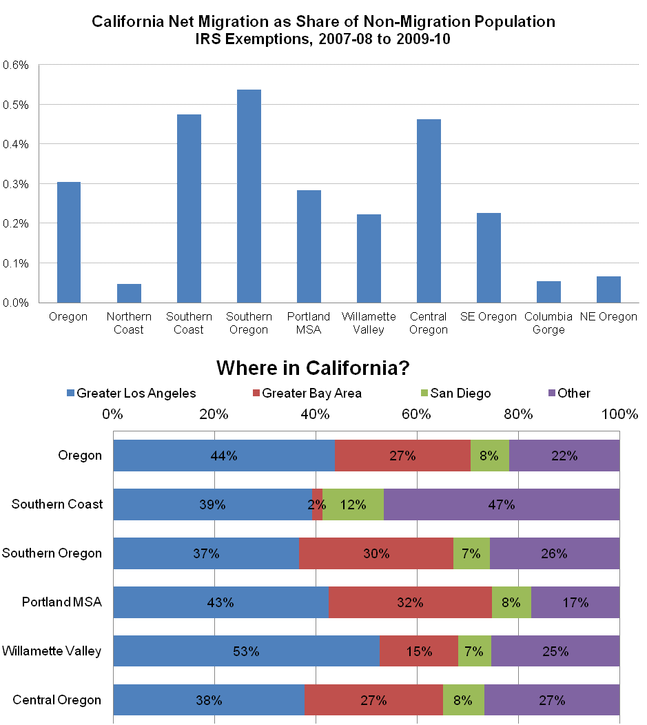
In terms of the California flows, they disproportionately choose to move to Southern Oregon, the South Coast and Central Oregon. Portland gets their fair share but overall the bigger trends are to those other regions. In terms of where they come from, they’re predominantly Southern Californian (LA and San Diego).
When it comes to migration losses to Washington you have a few different patterns. The largest declines declines are seen in the Portland region and in Northeast Oregon. Portlanders move almost exclusively to Clark County while those in Northeast Oregon move predominately to Tri-CIties, WA.
When it comes to migration from all other states, the majority of them do go to the Portland Metro however the coastal regions and other west-of-the-cascade regions do see some influx. The net outmigration from SE Oregon is entirely to Idaho. If you exclude Idaho from that group then there is a small net in-migration.

Finally, when it comes to Portland’s push and pull the region receives their fair share of Californians, loses quite a lot to Washington but disproportionately gains from all other states in the country, accounting for about 90 percent of all the statewide gains over these years.
 Given the recent and on-going discussions, I just wanted to share these graphs as they form the underlying base in our comments and outlook when it comes to the demographics of Oregon’s regional economies.

[…] migration patterns for Portland to Seattle and Clark County, Washington (Vancouver/Camas). In the first migration post, it showed that 82% of Portlanders moving to Washington moved to Clark County, while 8% moved […]
By: One more on migration | Oregon Office of Economic Analysis on September 5, 2013
at 3:14 PM
[…] growth, state economist says | OregonLive.com based on this blog post and paper presentation: Migration | Oregon Office of Economic Analysis It isn't that many poor retirees are moving IN to rural areas, changing the age balance, it is […]
By: Are all the people retiring to Oregon dragging the economy down? - Page 2 - City-Data Forum on December 7, 2013
at 8:48 AM
[…] more on where these migrants come from and where out migration occurs, please see this previous post. Our office will have much more in the near future on the subject as we will be discussing these […]
By: Graph of the Week: Migration | Oregon Office of Economic Analysis on January 23, 2014
at 10:13 AM
[…] Like the rest of the state, the vast majority of the region’s migrants come from California. In terms of relative size, Californians overwhelmingly choose to live in Southern Oregon and on the South Coast. Approximately half of these California migrants to Coos and Curry Counties come from the greater Los Angeles area or San Diego. The other half come from Northern California (excluding the Bay Area) or the Central Valley. Hardly any come from the Bay Area itself. In terms of migration off the South Coast, the region losses population to the rest of Oregon – mainly to the Willamette Valley, but not to the Salem metro in recent years – and a little bit to Washington state – almost all to Clark County, with small gains from elsewhere in the state. See here for more on migration. […]
By: South Coast Update | Oregon Office of Economic Analysis on March 12, 2014
at 9:24 AM
[…] been coming from the Bay Area, since the majority of the migrants are coming from SoCal, at least last time our office dove into the county to county migration data from the IRS. Also this may be a bit different today with all the tech outposts in Portland in […]
By: Migration (In Defense of Californians) | Oregon Office of Economic Analysis on September 8, 2015
at 10:05 AM
[…] the state’s urban areas. And from there many do end up in the Portland region. This includes net migration from the rest of the Willamette Valley into the Portland area. However, that patterns appears to have shifted. For the first time I can remember we are now […]
By: Fun Friday: Guard the Northern Flank | Oregon Office of Economic Analysis on June 22, 2018
at 9:34 AM
[…] I wanted to post a couple of charts that are updates from work we did six years ago. These look at where in Washington folks from Oregon are moving to and then where in California […]
By: More on Migration to Oregon | Oregon Office of Economic Analysis on July 18, 2019
at 10:55 AM