Following up on the previous overview of the latest state GDP release, the following provides a look into the manufacturing sector. One question commonly asked is “Why does Oregon rank so well in terms of GDP?” Our office’s reply is at least two-fold. First, state GDP is not the be-all end-all for economic measures when examining a regional economy. Oregon tends to rank low in terms of per capita income growth and the past few years around the middle of the pack for employment growth. The truth of the Oregon economy is somewhere in the middle between our lower income ranking and high state GDP ranking. Second, our manufacturing sector (durable goods, computer and electronic products, in particular) is very productive and on an economic, value-added basis really drives a lot of the growth.
When examining the state GDP figures, as the BEA noted, durable goods manufacturing was the leading driver of growth in 7 out of the 8 regions in the country and in Oregon it accounted for 2.9 of the 3.9% growth in 2012. As a share of the state’s economy, manufacturing output was 39% in the total in 2012 which is triple what the national average was last year (12.5%). The relative rankings among all states can be seen below. It must be noted that some of this Oregon figure has to do with the recent and on-going expansion at Intel. For example, back in 2007, Oregon’s manufacturing sector accounted for about 25% of output, double the national average. The 2012 figure of 39% reflects both a lackluster recovery in other sectors and the strong growth, partially driven by the expansion, in the manufacturing industry.
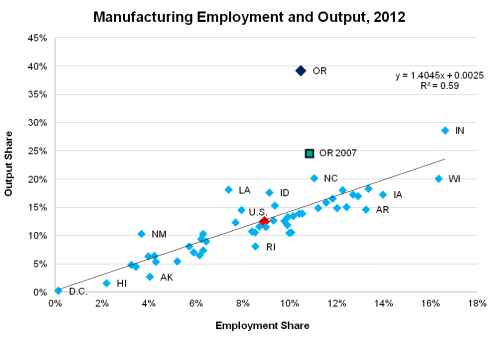
Not only does manufacturing account for a large portion of the state’s economic output, we also know it is a relatively large employment industry when compared with other states. In 2012 manufacturing jobs were 10.5% of the Oregon statewide total, compared with the national average of 8.9%. As seen in the scatter plot below, the share of employment in manufacturing is highly correlated with the share of a state’s economic output due to manufacturing. This should not be a surprise, obviously. However, what really jumps out is how far above the trend line Oregon is. Our economic output is significantly larger than our employment share alone would indicate. Again, recent years data is somewhat distorted due to the expansions (obviously this is a very good thing!), but if you were to use the pre-recession, 2007 figures as shown below, Oregon still outperforms the trend line by about 10 percentage points.
One reason for Oregon’s being significantly above the trend line (and why other states are further away as well, either above or below) is due to the composition within the manufacturing sector. Not all manufacturing industries are created equal in terms of employment, wages or output and in Oregon we happen to have a significant number of the highly productive types. The states above the trend line likewise tend to have a manufacturing breakdown of more highly productive sectors and less of the lower productivity sectors. The opposite is true for the states below the trend line. In terms of which sectors are more productive than others, the graph below shows economic output per worker for the nation overall. (Taking BEA industry output divided by BEA employment by industry)
Oregon’s manufacturing employment follows a somewhat similar pattern, with our largest sub-sector being the second most productive at the national level.
Putting all of the above together yields strong state GDP figures for Oregon. Moving forward, our office expects a) the economic expansion to continue and even pickup somewhat, particularly in terms of jobs and b) Oregon to continue to grow a bit faster than the average state. Also, as the economy strengthens across all sectors, the share of the state’s output due to manufacturing is likely to fall (likewise after the expansions are completed) but for good reasons, not bad.


[…] Using the same broader industry definition, this first graph takes a look back at the historical evolution of high technology employment in Oregon. Over the course of the 1970s and 1980s the industry steadily grew to around 60,000 by 1990, or about 5% of the state’s total jobs. During the 1990s and in particular during the second half of the decade the industry experienced tremendous growth (averaging 7.4% annually from 1994-2000). Of course this time period is associated not only with the technology ramp-up in the U.S. but also the dotcom bubble. Major investments were made in high technology at this time and numerous new companies received high valuations upon going public. As the bubble burst, sending stocks tumbling and the economy into a brief-from-a-GDP-perspective recession, employment in the broad industry plummeted over 23%, compared with losses of around 4% for the state as a whole. Much like the NASDAQ, employment in the industry has never fully regained the jobs lost during the 2001 recession, however employment has remained relatively stable as a share of the state’s jobs at 5-5.5% over the past decade. In terms of state GDP, the industry has a much larger footprint and really drives the state’s value-added production. […]
By: Oregon’s High-Tech Industry | Oregon Office of Economic Analysis on September 6, 2013
at 8:41 AM
[…] For more on why Oregon does well on state GDP, please see our previous posts on Historical Economic Performance and Manufacturing Employment and Output. […]
By: State GDP 2013 | Oregon Office of Economic Analysis on June 11, 2014
at 10:51 AM